Sunday 28 October 2012

All Things Dark and Beautiful Continued


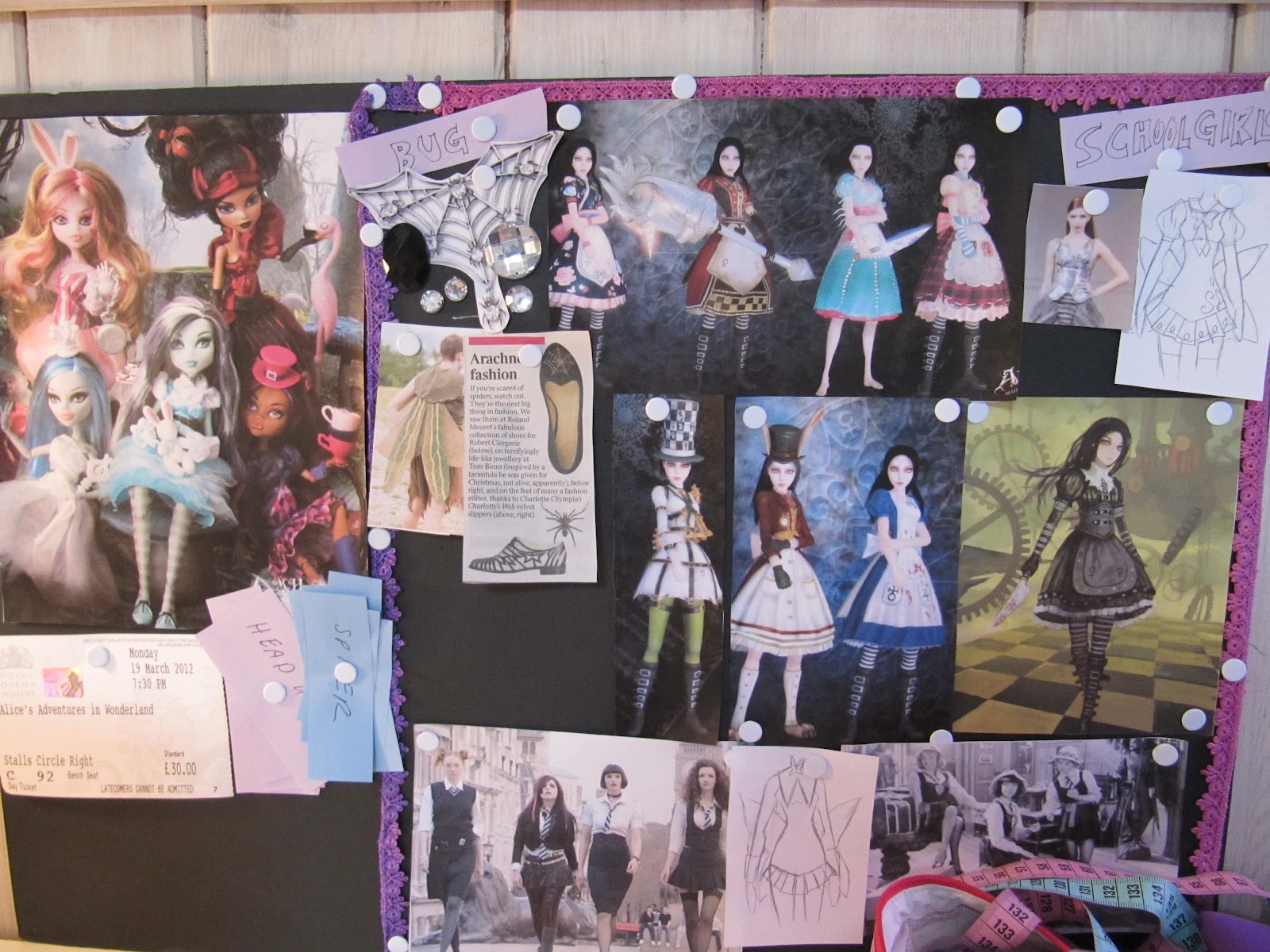
From maroons, blacks and dark purple tones, with some details that varied from brocade to subtle, following this theme actually provided a lot of looks for the upcoming party season! I was especially delighted with the special today in the Sunday Times Style magazine on goth make up, the drama it instantly achieves and how it’s departed from its past reputation of being the uniform of an angsty teenager to seductive and edgy. Again I am so glad that last year while working at the Excel centre for Britain’s Next Top Model, finally facing facts that I will never be able to pull off that gorgeous Marilyn look with red lipstick, I invested in dark purple gloss and lip liner. Another fact I love about this vamp make up rave is the fact that it loves pale, flawless skin. I’ve always been kinda pasty, and to this day can’t apply blush to save my life, and am glad that my complexion is considered a trend. Coupled with blood red and burgundy nails, I’ve got the make up part of this theme covered.


When searching for all things dark and beautiful in my closet, one of the first to come out was my beloved ‘Alice’ dress-named for its ‘babydoll’ feel with the buttons, umpire waist and bishop sleeves with wide wrist bands. I love accompanying it with vibrant tights, such as these pink or burgundy toned tights, though a favorite is a gold floral lace pair. With a simple black pearl, I always feel like a gorgeous goth girl right out of a Tim Burton film!


My next look was aimed towards the bar scene, with another little black dress, only this one tight and with short sleeves. This red velvet tailored blazer is a favorite piece for the season, and because it gives just that burst of color I broke my crazy tights verdict and opted for grey, or even black lace stockings. Then, for a more club atmosphere I put together a selection of various silver chains and pieces. One of these days I really wanna get a cool black clutch, but until there this little black satin purse will have to do.


To make a brief departure from the hype for the party season, this outfit is slightly more casual, probably could be pulled off as a day to night look. I don’t usually wear single color pieces top and bottom, like this turtle neck top and black leggings but when paired with the velvet jacket becomes less Catwomanish.  With a statement necklace and chunky Dior chain bracelet, I see me going to drinks after work or even a movie in this look easily.


This look features my treasured Vamp top, a satin dark purple blouse with puffed sleeves that had me teased for looking like Maleficent (not that I’m complaining-BEST DISNEY VILLAIN EVER), but is now considered gorgeous. I always feel so sharp in it, and have worn it to events from the recent Hollywood Costumes event at the V&A. Usually paired with black leggings, sometimes I add a thick banded leather obi-style belt with it, that creates more diversity with the combination of textures. 


This neck piece I bought several years ago from a stall on Portobello had to make an appearance, since it always offers an allure of Victorian prudence and posture with it’s high neck line and ruffles, guaranteeing character to any basic black sweater. However I think I prefer how I used to style it, on top of a black shawl wrapped around my shoulders, paired with jeans to give it a bohemian look. The black jet stone and black roses earrings would also go with the season’s brocade trend brilliantly.
Honoring Halloween, appropriate for a number of occasions and even a mixture of sassy and dramatic, I hit the nail right on the head this month!

Monday 22 October 2012

October: All Things Dark and Beautiful


It’s that time of year again. The leaves are turning gold, the nights longer. Yes, it is the season I cherish the most-Halloween! The one time of the year when eccentricity and the allure of the supernatural are celebrated. And so to celebrate, I’m doing a tribute this month to vampires, ghouls and all things that go bump in the night.
The mood board I created for this theme was pretty easy, especially since I’ve been saving some pieces just for this month! The first thing to go on was a page from the Jubilee of a Caroline Herrera shoot with the theme of the Wicked Queen from Snow White. Another image to have a prime spot was the man of the season himself, the amazing Tim Burton. His films have such a sweet innocence to them, despite their dark overtones, in the fact that all the characters have genuinely good intentions. Take his upcoming film Frankenweenie, about a boy who just wants his beloved pet dog back! 
For the past two years, winter catwalks have definitely taken a page out of Anne Rice novels with their ‘vampish’ styles, the models coated in pale foundation and dark lips, dressed in velvet and black leather. The direction I’m thinking for this month is a modern take on the goth look, with not just black but shades of maroon and dark purple, romantic with an edge. Think a vampire going shopping along Bond Street! 
Emma Watson was my first muse for this month, after seeing a shot of her in a Zac Posen gown. The witch girl of this era, Watson has this stunning ‘pixie’ look, with her slender frame, though she has such down to earth morals. 
My second muse is Chloe Grace Mortez, the creepy little kid from films Let Me In and Dark Shadows. I find her stunning, for such a young age she has such mature features with those full lips, and her characters always have a hard-as-steel attitude. Plus, I love her red carpet looks, from her red velvet McQueen gown to this beautiful take on the off-the-shoulders puffy sleeved dress with a pencil skirt frame!
So maybe not exactly ‘things that go bump in the night’...more like things that strut in the night.

Friday 5 October 2012

Professional Yet Personal, Continued


I wanted to do a follow up entry, showing what I’d come up-including looks I had worn to interviews. But considering how so far the number of interviews I’ve had so far comes to a grand total of, um...ONE, I figured I’d go ahead with it anyway


This first look is the outfit I wore for said interview, for a position at London Fashion Week when I was working backstage for the designer Jeffrey Michael show. Both pieces had a boxy frame, this blouse from Ms. Selfridges and this Whistle tulip skirt, and how the waist is cinched made me worried I’d look dumpy. But, considering how the interviewee was taken at once by how well presented I was, I’d call this a success! My Tiffany key, a statement piece and lucky charm, had to make an appearance, thus my main choice for the top. I love this mustard color, and wear the top a lot with a pair high waisted maroon jeans when going out!

The shade of this dress works great with silver and gold tones, with bare legs or some chocolate colored tights for a wintery wardrobe! I love that lilacy-grey shade. Also, this thick Alice band with a cool art-deco pattern that gave it a great 60’s retro vibe. I’d place it with black pumps for now, but would be paired with some high boots depending on the season.


This is actually the look I wore backstage for the Jeffrey Michael Show at LFW-unlike the usual uniform all black for backstage, we were encouraged to look smart, since the press would be coming around after. I was rushing off to a cocktail party straight after, so I wanted something that could easily slip from day to evening. 
I’m loving this topaz color for the fall. The flare of the top complimented the skinny black trousers, staying true to my love for androgynous style. I coupled it with the art deco band, and got tons of compliments for the vibrancy of the look! Afterwords, I traded the headband for hoop earings, darkened my eye make up and swapped my flats for black heels, and was ready for the bar.


I wear a lot of teal-it’s such a radiant shade of blue! It’s the reason I was instantly drawn to this blouse from Anthropologie last month. I paired it at first with a pencil skirt, but it looked way too frumpy, so I stuck to black skinny trousers, though I would love to try with some high waisted flare black dress trousers. Jewelry can be a lot of things, though I’d probably go for some silver bangles.


This were some of the looks I’ve come up with. I’m glad to have covered the jewel tone bases, but have to admit guilty in using a lot of black as a foundation palette-but can you blame me? So if (and when) I finally succeed in landing some interviews, hopefully I can put them to good use!


Friday 21 September 2012

Professional Yet Personal


This is the season any fashionista dreads; that notorious ‘in between’ period, when it’s still sunny enough to keep out summer shades, but breezy enough to consider pulling out some of those sweaters stashed for Fall.
Coming up with a theme for this month was tricky. One thing I love about September, is that ‘back to school’ sensation-new people to keep, changes to come etc,. So that was my inspiration-not that I’ll be backing a satchel anytime, but I am currently job hunting-in short, this month’s mantra-‘Hire me!’
I truly believe in first impressions, and so for this particular entry I’m concentrating on putting together an ‘Interview’ wardrobe, focusing on work attire that will hopefully land me some offers. There’s a problem I see today in the office attire. There’s a thin line between following the ‘dress for success’ status quo, but without loosing your own individuality. Loads of women today are missing out on so much in their trouser suits and boring button up blouses! There is a massive window of opportunity here to make a signature style piece, ladies!

And what better muse than Joan Holloway? Bringing sexy back with poise, intellect and a pencil skirt, Joan may be stereotyped as the slutty secretary at first glance, but dang, does she play her cards well. She knows she’s got it, so why not use it? And even as she flaunts her assets, she always maintains a cool air of impeccable professionalism. What I love about that time period, from Mad Men to Rona Jaffe’s novel ‘The Best of Everything’ is that Metropolitan glamor-when women were fending for themselves, leaving home and setting their own terms.
My plan is to take a conservative approach-a pencil skirt, a pair of flattering dress trousers etc., as a foundation than add elements that’ll just add a little character to the look. Christina Hendricks’s costumes, for example, emphasis her savvy in control attitude with their jewel tones-sapphire blues, ruby reds and such-even her signature gold pen! Over the past few weeks I’ve been drawn to emerald and topaz greens- such shades would leave an impression for sure when matched with subtle black leggings etc. Just something that shows I’m right for the job, but without sacrificing my own style.


Sunday 1 July 2012

July: Pirates, Witches and Gypsies


I’ve been considering taking a bohemian exotic experimentation. Pirates also came to mind-a roguish clash of color with a bold roguish way that different pieces mesh together. Gypsies and witches were another inspiration. When I was having my annual Charmed marathon, the style of the three stars on that show got me thinking. In the first series, the sisters’ style was particularly sterile-Pheobe, rather aimless in life, was constantly in t-shirts and jeans, Piper wore Gap-worthy ensembles and I was beginning to wonder if Prue owned anything that wasn’t black! But as the series progressed, their styles became more defined, more glamorous. You could see how their witch lifestyle influenced their bohemian taste. Paige was probably owned the most eccentric from episode 1-bold colors, miniskirts, vibrant hair dyes. 
There were a couple of things I found in common in the costumes on that show. First, with the exception of Paige’s red lipstick, make up was always subtle-nude shades and earthy tones. Second, their tops were always the highlight of the ensembles-low cut, umpire waistline, gathering details etc. They’d rely more on how the clothes were put together rather than accessories, emphasizing natural beauty. 

Taking a turn with the vibrant shades recently, I’m going for a sensual, ‘enchantment-inducing’ style. Darker colors-maroon, indigo, olive greens, even mustard, but playing with the gypsy/pirate factor, adding some exotic jewelry and scarves. Maybe I’ll even get over my feelings about wearing prints! 

Sunday 10 June 2012

(Belated) May Moodboard: Candyman


I’ve been trying to get my head round this whole kitsch trend-how to accept that all things sugar, spice and everything nice are the height of style. And honestly, I love the cheerful color tones in anticipation for summer-I just shutter at the idea of dawning a tutu and circling my mouth in fuschia pink lipgloss.
It was the ultra-girly factor that I couldn’t take, since my style these days is very androgynous-soft shaded tunics and tight high waisted jeans. Janie Bryant, the costumer designers for Mad Men, quotes in her book the Fashion Files that ‘there’s nothing more alluring than a woman who knows how to cross-dress’. Finally a collaboration came to mind when listening to Christina Aguilera’s ‘Candyman’-girlish shades paired with an athletic silhouette. My mood board consists of images from Audrey Hepburn in a pair of capris, to the current Louie Vuitton campaign set in an ice cream parlor. 
Like the mermaid experiment, I wanted to go for a fun, bright mood. Pairing tomboyish style-crisp button shirts, capris, that ‘Marilyn Monroe-off-duty’ tone from the film ‘My Week With Marilyn’, but with bubble gum tones; minty green, frosty pink etc. I’m inflicting a ‘no skirt’ policy, and trying to make the most of chic blazers (think Joan Jett’s hot pink tux), playing with the structures of menswear that came out in the 40’s but playing with fresh cutsey colors.

Tuesday 1 May 2012

May Mood Board: Mermaids


Feeling nostalgic recently, I watched ‘The Little Mermaid’, and it soon became the inspiration for my first mood board. I browsed other interpretations of ‘mermaids’ in film, and fashion, from the 90’s Australian teen show H20, to the 2003 film starring supermodel Erika Heynatz. 


My mood board consists of the colors orange, teal and sea foam green. My favorite image I found was a photo shoot with a scuba diver model waving a handful of pearls. If anything, it makes me yearn for the warm weather (it hasn’t stopped raining since I got back from Bahamas...) Instead of going with the traditional ‘shell bra’ , every pubescent boy’s dream image, I thought what a mermaid would wear when on land. I had the image of the fresh faced, athletic type, looking like she dressed in five minutes, her look effortless yet gorgeous. But when in her own element, I couldn’t help imagining a love of all things shiny, wearing some serious bling savaged from shipwrecks.

Embodying this, I gotta say it does make me optimistic for summer. My selection has consisted of a lot of Gap classic tops, while tossing in some bright colored jeans and comfy sketchers. And as a bonus effect-I can’t believe I’ve done this-I invested in some coral pinks and sea foam green nail polishes! 

Oh, and of course, pearls had to make a cameo in this collaboration.


The overall effect of this theme is light, carefree and fun. The lighter make up application, unlike my usual black liner cat-eye flick, is really refreshing. The lighter tones brings hope for sunnier times to come, and has given me a little insight into this ‘kitsch’ thing-without being too sickeningly sweet.

Saturday 28 April 2012

New Directions


I know its been a while since my last entry, and for a couple of reasons. Mostly because in light of me seriously wanting to pursue a career as a stylist, have decided that this blog needs some changes. Though still a crafter at heart, want to be more fashion-forward in my blog.
The past couple of months my projects have become a lot more focused since putting up a mood board over my workspace. I know with Pinterest mood boards are very much the rage, from brain storming to general inspiring visuals in everyday life. For my doll work, I’d pin up technical drawings and patterns I wanted to use, fabric swatches etc. And to anyone who hasn’t jumped on the mood board wagon yet, I strongly advice it! Yes, it may sound a little scrap-booky, but as a way to  channel ideas towards a final product it’s a brilliant jump start.
I have yet to sign on for a Pinterest account myself. Personally I find the 3D aspect easier-you can move images around, stick on real objects, chuck one thing and replace it with something else more easily that way. 
So that’s the way forward for this Second Child. A different theme on the board every month to set a dress code for me to meet. It’ll combine my love of costume design, creating a character though clothing while spinning off trends to test-drive. I know some will be hits and some will be serious misses-for example, I detest the candy color tones right now, but am willing to give this ‘kitsch’ thing a try. I’ll post the most distinct results, take photos, and even drop tips for the best buys. 


Well, time to get this baby rolling-Ciao!

Saturday 17 March 2012

An Eco-Friendly Project

Happy St. Patty's Day, everyone! And in the spirit of being green, thought I'd take a little turn and discuss an issue that any designer or crafter should be aware of.


The past few years, I’m really intrigued by the effort people have made to help the environment. Such schemes have not only made the public more aware, but made recycling trendy! Look at companies such as Good One, upcycling old clothes without making them too hippie like.
Last December, an article ran in the the Sunday Times Style magazine on alternatives to Christmas wrapping-methods like spray-painted brown paper and such, but I was most intrigued by the use of magazine pages. From working in a store during the Christmas season, it’s incredible how much resources are wasted, not to mention so much money wasted. There are so many ways to make the outside of a gift a work of art!

By choosing the right image, with a fun color palette, you can have a brilliant and original way to wrap gifts from magazine pages, such as cover shoots or perfume ads (I myself collect to decorate my closet door). While flipping through the Mark Montano book, I thought of using the same method, but with greeting cards. Montano’s book offers a brilliant template for an envelope with a small plate for a message itself.


With mother’s day, and a couple of birthdays coming up, I make a mock up of Montano’s original outline for the envelope, then went through my stash of magazines until I found a great cover shot for the front of the envelope. I added on two one layers for the inside of the message, one more from a magazine add, but the other out of some bright colored paper.


It’s not a stylist job, but I strongly encourage eco-friendly folk and crafters alike to consider this as an alternative to rushing out for every birthday, anniversary etc. and get another big name greeting card company. 


Wednesday 7 March 2012

Terence Conran at the Design Museum


For the past two weeks, my creativity juices haven’t exactly been co-orporative. In fact, since my boss has been sick and I haven’t been in the studio or even working around fashion, they’ve been non-existent. With all this free time, I was desperately trying to feel inspired for a project to pass the time-but no matter how many times I leafed through Tatty Devine’s book or visited my favorite haberdashery hotspots, nothing has really came to mind. 
So I decided to venture out and try something completely new. Today, on a very typical rainy windy day in London, I ventured to a location I’ve never visited-the London Design Museum near Tower Bridge. The space itself has been around for almost forty years now, exhibiting displays from unseen pages of Vogue to up-and-coming interior designers. I was grateful to see the little 'No Flash Photography' sign, allowing me to take these pics-though in general I make it a rule not to. I will never forget what my Art Teacher in High School told me, about how the camera lens has replaced the human eye, and when people see something amazing, they instantly pull out their camera rather than taking in the actual experience of seeing it themselves.
Terence Conran, whose had a longstanding relationship with the museum, was presenting the span of his career. Conran’s career covered a lot of ground, in design as business, from owning a restaurant to opening the famous Habitat chain. He has a brilliant eye for design, but also considers it’s practical elements in business.


I thought this gift tag, designed by Conran aged 13, was so sweet, and already shows his eye for detail. The wonky lines makes it even richer-it reminds me of the little book markers I used to make for friends and family as gifts when I was a kid!


The organic nature of hand-drawing continued throughout his career, including his brief time as a textile designer at Central School. This design I was drawn to because of a color combination I’ve become fascinated by-lime green and lilac purple. In my doll art, I’ve really tried branching out with my palettes, and often draw upon coupling opposites on the color wheel. 


This came up later when, looking at the interior design section of the exhibition, I found a painting-or rather, a pair that were connected to create the image of a woman slipping through a set of sliding doors. With spring, slowly but surely, attempting to make an appearance, I’m intrigued with the idea of doing a project in that minty-green and pastel orange pairing. With my annual trip to Bahamas coming up soon, I’ve been wracking my brain for possible projects to bring along-maybe a cute bag in these shades could be the answer to this!
So, I think I’ve got my creative mojo back!

Sunday 26 February 2012

Alice Re-Vamped Band

Recently my favorite ballet of all time is returning to Covent Garden next month-already planning to wait at 6am for tickets. This production of my muse Alice in Wonderland is fantastic-the choreography stunning, and the visuals overall amazing. But what struck me about this particular Alice is the title role’s costume choices. Like Tim Burton’s interpretation, this Alice is older-interested in boys, the eldest of three daughters etc. Second, the fact that she’s put in a lilac frock, unlike the traditional blue-I always categorize the cast as having their own distinctive colors (Mad Hatter Purple, Queen of Hearts Red), so I’m intrigued by this choice. And finally, her hair-an almost 30’s style brunette paige boy cut. It’s odd how everyone always visualizes Alice as a blonde, even though the original Alice Liddel herself had black hair. Either way, another effect had adds to the avante garde of this production. 
Alice’s hair inspired this project-another idea curtesy of Mark Montano. The ballet version stays true to one element of Alice’s look-the all popular ‘Alice’ band. 
Since I got my own paige boy bob last summer, a style I wonder how I lived without all these years, I’ve like playing around with accessories. This project I thought appropriate considering how the summer is coming, and the usual wedding season is coming, thus bringing in the unique hair piece rage. I doubt I’ll ever set foot in Ascot as anything other than the waiting staff, but nice to know I’d be prepared should the day come!
I dug through my ribbon stash, and found some black net trim and greyish silvery ribbons. Laying them on top of one another, I preferred this effect to that in the book with the black toole. I cut three sections of each different trim into 7’’ lengths, and folding them each tacked them together into a rosette shape. 


I debated for a while about the sequin centre piece from my ‘bag-o-gems’, but finally went to a black piece-not so glitzy, but it looked better against the lace effect.


I’m a little nervous about wearing the piece just yet-worried it may make me look like a six year old. But I know accessorize are all about boldness-heck, I may even wear this piece the night I go to the ballet!

Wednesday 22 February 2012

Montano Tie Obi-Belt

I’ve become such a fan of the Mark Montano book, I ordered its prequel this week! Already tempted to get his other on home decor. 
For my second shot in his fabulous projects I made the ‘Tie Obi-belt’. I’d been keen for a while-it looks so simple, and this totally appeals to my upcycling and meshing different pieces together. I had a simple black tie from one of my old catering jobs, but got impatient from donations from the only male in my household (my Dad), so bought a fun tie from Topman-black with white specks. I chose the colors based on the quirkiness yet versatility of the two ties together. 


After working overtime with my current job, my fingers were itching to reconnect with my old friend, the sewing machine. But when she failed to work, I had to resort to hand-stitching the calico base against the section where the ties meet, which gives the belt its ‘obi’ feature. The two stitch lines add to the 'bulkiness' of the piece.


This project is really fun, and I can’t wait to spice up some simple tops with it. I hope to finally get those old ties from my Dad sometime-I wanna try out this project with more exciting textiles and shades.

Sunday 12 February 2012

Catwalk on the Tower

Hey-sorry, my computer was busted this week! However, it lives to program another day, so Second Child blogs on!
Two weeks ago I had another dresser gig, for the Adidas Tailor Made Goldwear show. The show featured the main pieces expected to be worn for the upcoming Olympics this summer-and seeing how my mother, a Golf obsessive, I knew was probably one of their best customers. 


In the afternoon in the Tower Hotel we did several run throughs. I was expecting the show to be kinda dry-I’m not a sports nut. The models were doing mock golf swings on the runway (though I pointed out several times that their drives looked more like baseball swings), dancing to some of my favorite tunes-now every show I have dressed for has played ‘Moves Like Jagger’. Models and dressers mingled and laughed backstage, and the collection had certain buzz.
But what really shocked me about this experience was the fact that when we moved to the real collection of the runway show, we weren’t here....

We were here.
Yep, the narrow walkway on top of Tower Bridge was the catwalk. Our backstage was a quarter of the walk, the audience two slim lines around the wall beyond the curtains. 
I haven’t been that cold since I went to Russia. IT. WAS. FREEZING! We were all huddled backstage, yearning to put all the extra clothes into a pile to curl up into-and the models, man! They had it ever worse, changing in those conditions! The organizer was surprised at how upbeat and lively we were backstage-the truth, we were dancing to the catwalk soundtrack to stay warm.


Fun and wacky in location, this experience was another interesting fact to add to my CV. Not many can say they worked for a runway show right on Peter Pan’s route through the city.

Friday 3 February 2012

Hair Comb Brooch

For my birthday, I was given ‘The Big-Ass Book of Crafts 2’ by Mark Montano. This book, written by a quirky crafter, holds a number of projects from jewelry to furniture. For the past three weeks I’ve been pouring over the book over my afternoon mug of Earl Grey, shifting book marks for projects I want to do next, ones I’m considering for gift ideas, ones that just look like fun, etc! 
This afternoon, I gave the ‘Button and Comb Brooch’ a shot. Digging around in the bathroom I found two amber-colored combs, that gave an antiquey feeling to the piece, and decided to replace the button with some rhinestones. 


I changed a few things-instead of the metal base, I got some cardboard and covered it in felt, that I stitched a safety pin into for the badge base. 


I had a heck of a time, breaking up the combs into small fragments-it was a combo of wire-cutters, a hammer, and sheer blonde-brute force! Glad no one saw how far my creativity had driven me.
Once done, laying the pieces around the base, I had a hard time overlapping the pieces with their bulkiness. I added in an extra layer of felt on the inside as extra-padding, so to speak. 


I had a number of color combinations regarding the rhinestone centre-piece, but with so many glue marks on the comb, I had more tiny white jewels to cover them, and so went with a gold and white color scheme.


 The final piece isn’t brilliant-the one of the book looks as thought hair combs are the last thing used in the creation! But I like the bold bling of this brooch, and am planning on putting it on my handbag, or even a hat.